A House of Cards - pick a card!
- March 12, 2014
- John Nurse
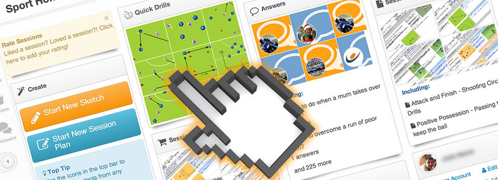
If you log into Sportplan this week you will see we have updated our home page design. If you use Sportplan on your smartphone you may have noticed the update a few weeks ago.
When we launched our new Web 2.0 site last August, we created the fast-content widgets of the home page, so we can offer users a quick overview of as many different types of content Sportplan offers, in one place. So you can jump into content quickly, but also highlight new and interesting content.
The idea was right but possibly the execution was lacking. We have been listening to you, our users, again and the structured scrolling boxes on our home page that many of you found tricky to navigate on your tablets and cumbersome on your laptops are now gone.
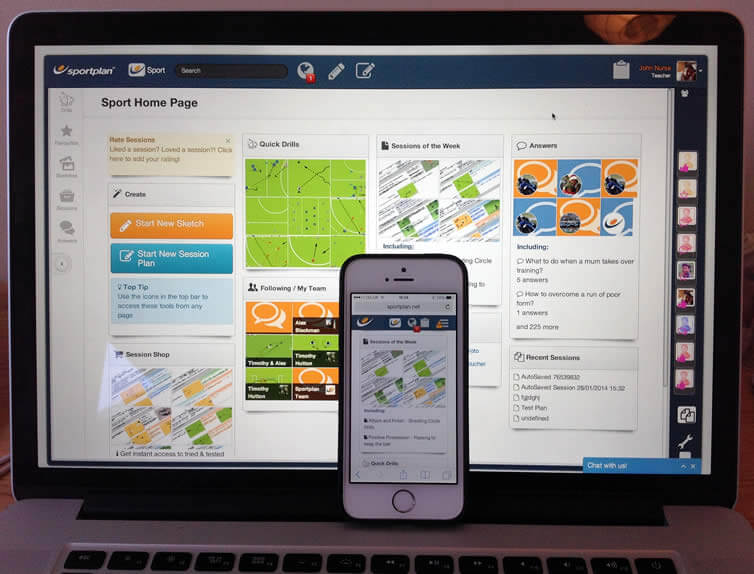 Frustrated by our in-flexible previous design and motivated to improve our tablet experience, especially as we push to complete our new hybrid/mobile apps (launching very soon). We finally decided on the Card User Interface Pattern you will see in Sportplan today, giving you fast attractive access to the content you want to see.
We love getting feedback here at Sportplan, be it questions about using particular tools or future feature requests, please do not hesitate to contact us via the Feedback Form.
Card User Interface Patterns are here to stay:
http://insideintercom.io/why-cards-are-the-future-of-the-web/
Sportplan's Card User Interface is built upon Wookmark Jquery-Plugin
http://www.wookmark.com/jquery-plugin